BLACK
POINT.
A film identity and website shaped by danger, memory and the pull of the sea.
Retribution runs deep.
Original feature film / In development
A period adventure set in the 1970s and 1980s.
A mark
with teeth.
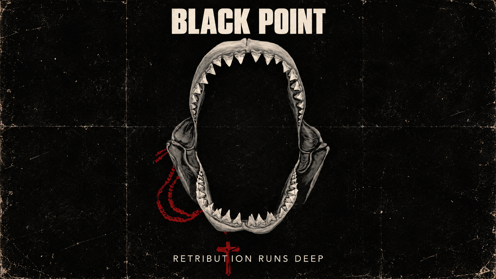
The stark title and shark-jaw symbol give the film an immediate visual signature. The open jaw frames an absence: danger you can recognize before the story has told you everything.
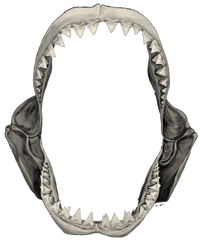 The symbol / One-color silhouette
Big type.
Quiet tension.
Impact gives the titles their compact, poster-like weight. Arial keeps the story and interface clear. Georgia appears in the filmmaker’s quoted reflections, adding a more personal voice.
RUNS DEEP.
A search for revenge. A struggle for peace.
Clear language gives the imagery room to carry the mood.
“These movies were not just idle entertainment for me.”
Click the display specimen to try your own words.
The sea goes dark.
The signal stays bright.
Desaturated images and deep blue-green surfaces establish the atmosphere. Warm ivory brings a paper-like softness. Acid green cuts through that restraint to mark links, actions and key details.
Atmosphere through restraint.
Closely related sea tones keep the background cohesive while warm neutrals connect the interface to aged prints and the ivory jaw.
Attention through contrast.
The high-chroma green creates a clear visual interruption. It works as a signal because the rest of the palette stays subdued.
Let the image
carry its history.
Creases, softened edges and worn paper turn the artwork into something that feels found and handled. The treatment ties concept art, photographs and page headers into the same world.
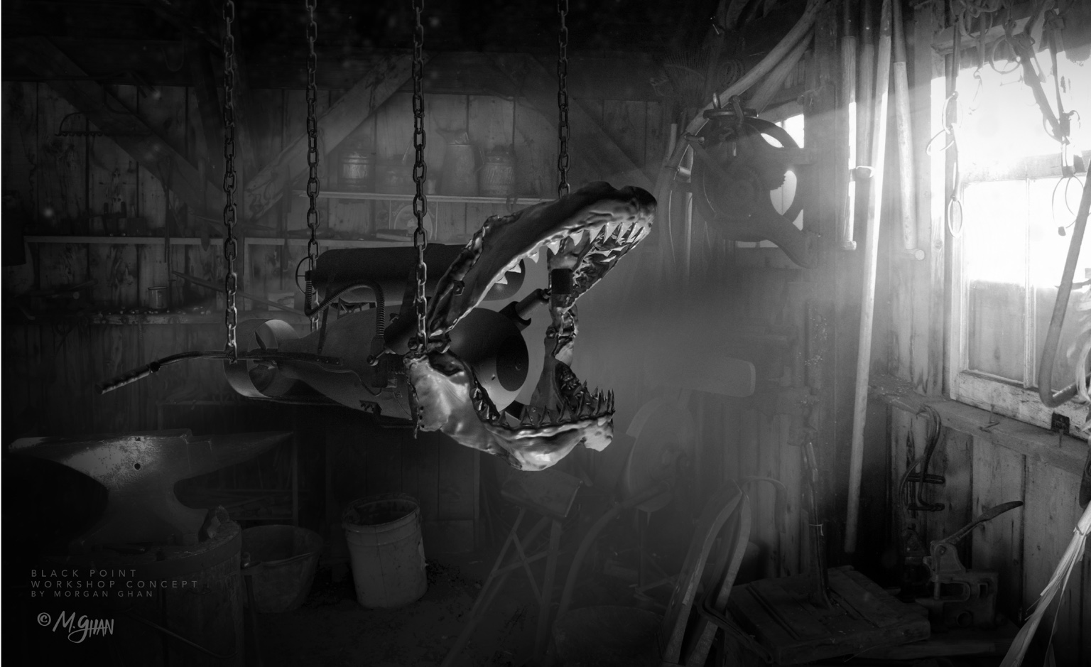
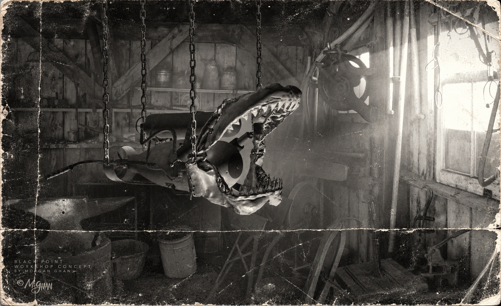 Site treatmentOriginal artwork
The workshop / Original concept art by Morgan Ghan. Move the slider to compare the two versions.
A world before
the first frame.
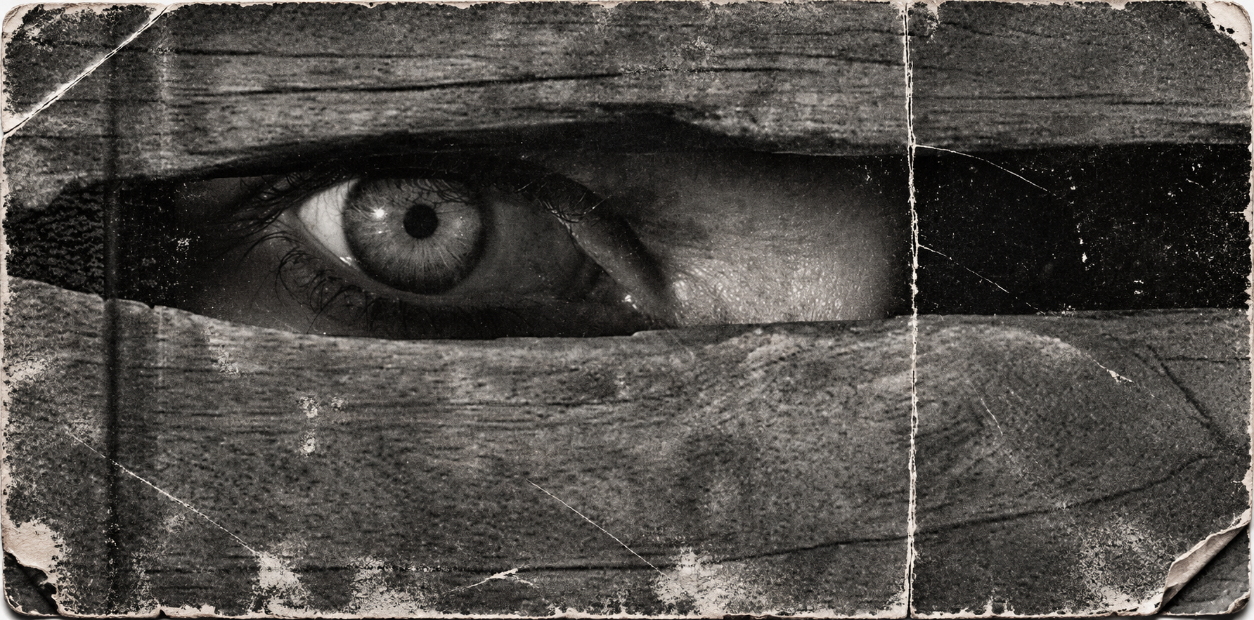
Coastlines, isolated buildings, an old map and a watchful eye give the website its visual vocabulary. Explore the original imagery used across the film’s online presentation.
Original concept and story artwork by Morgan Ghan. Point Reyes photograph: M. Ghan, 2010. Black Point is a feature film in development; this collection presents development visuals and website imagery.
Set the mood.
Then let it move.
The opening loop introduces the tone before a visitor reads the story. Its pacing, weathered texture and dark overlays extend the still-image language into motion.
One atmosphere.
Every chapter.
Story, vision, filmmaker and project pages share one visual structure. Each gets its own image, while the title treatment, palette and navigation keep the experience connected.
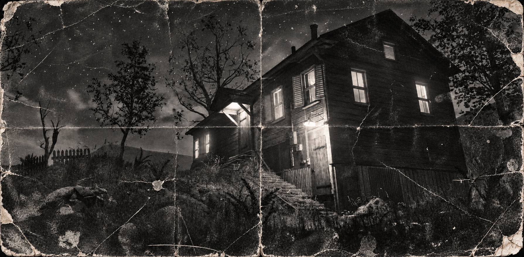 01 / The story
The Story
A search for revenge. A struggle for peace.
 02 / The vision
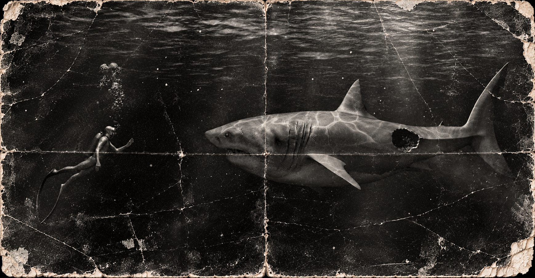
The Vision
The scale of an adventure. The intimacy of a personal journey.
 03 / The filmmaker
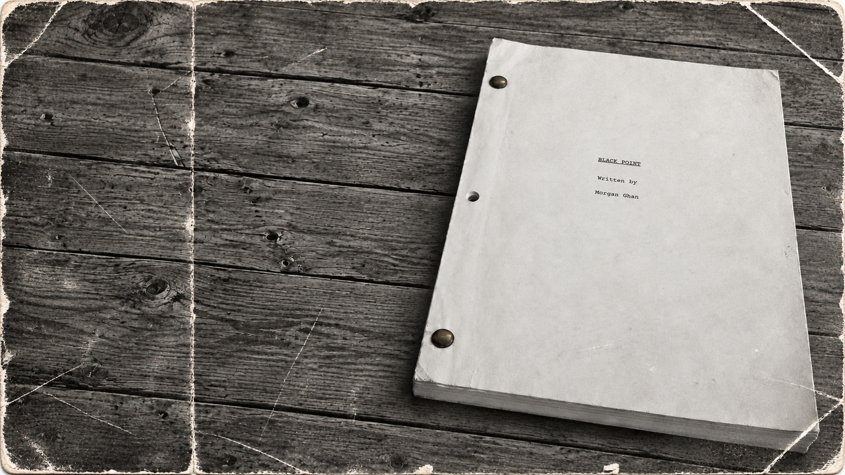
The Filmmaker
Morgan Ghan · Writer and filmmaker.
 04 / The project
The Project
An original feature film. A completed screenplay.
Make the atmosphere
part of the identity.
The title, jaw, color, typography and weathered artwork work together to give Black Point a recognizable world—one that carries from a small symbol to a full-screen cinematic introduction.
Explore the original website