Come together.
Make something.
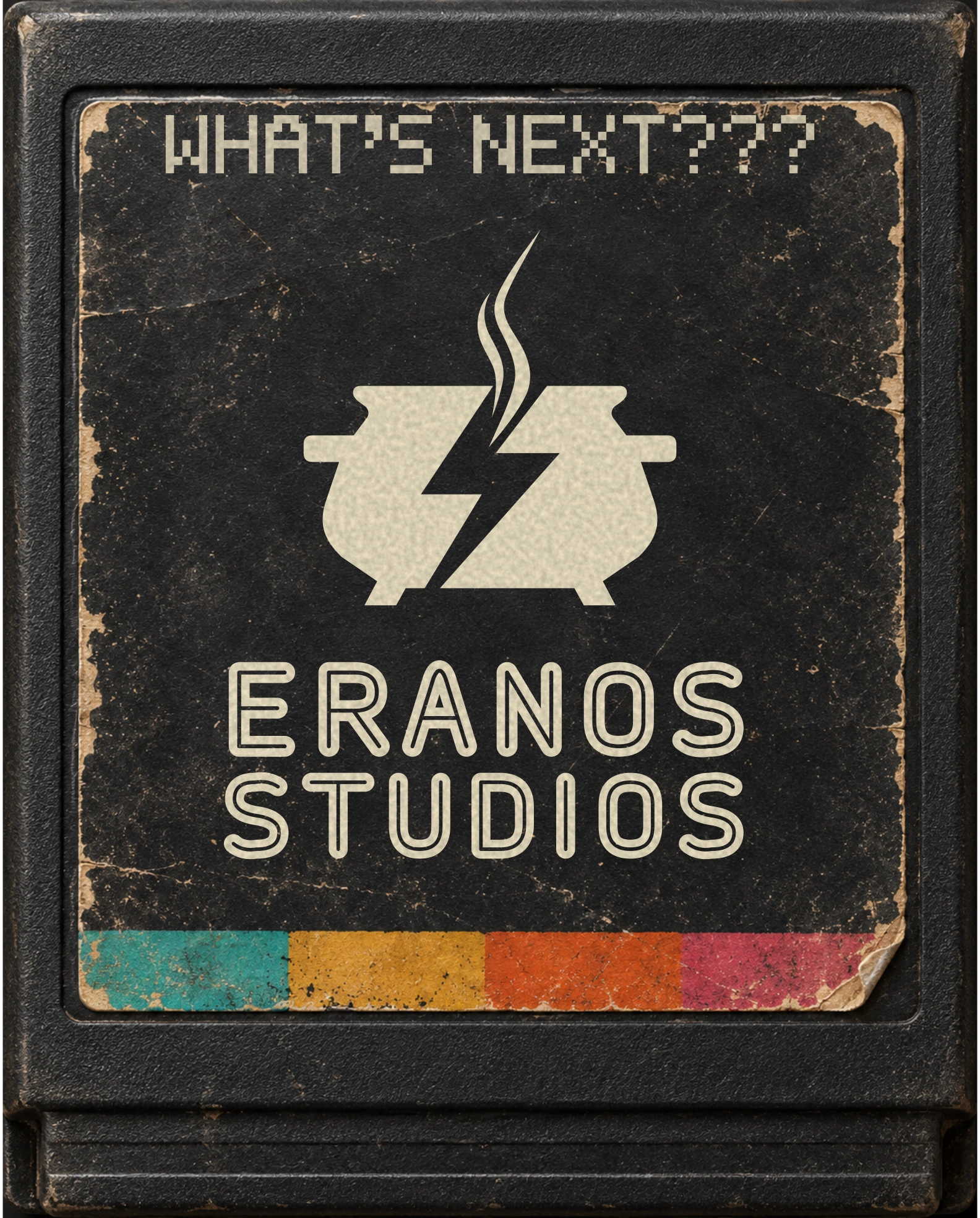
Eranos means “potluck” or “gathering.” That idea anchors the name, symbol, collaborative language, and invitation to join the studio.
A study of the brand identity, art direction, and website design for Eranos Studios.
Made to play. Built to feel.
A digital studio identity with a physical soul. ’70s console warmth meets ’80s arcade, Skateboarding and BMX attitude.
Eranos brings different creative disciplines to the same table. The visual identity makes that spirit tangible: a shared vessel, a flash of energy, and a collection of objects that feel like they belong to the games we grew up with.


Eranos means “potluck” or “gathering.” That idea anchors the name, symbol, collaborative language, and invitation to join the studio.
Woodgrain console furniture, collectible cartridges, checker canvas, and graphic stickers give the identity its period character.
Wear, softened edges, printed labels, and material texture make a screen feel familiar and handled.
Eranos Rounded gives headlines their arcade-like silhouette. DM Sans keeps the interface clear. Short, welcoming language carries the studio’s collaborative character.
The display lettering is part of the identity, not just a way to fill a headline.
Night and warm white ground the interface. Turquoise signals action. The worn spectrum gives the world its color.
Color travels toward the shared vessel. The lightning catches. The symbol becomes a small story about collective creative energy.
Good things happen together
One physical format, multiple stories. The studio identity, SurfRat, the Quest for Eranos, and the mystery of what comes next all live inside a worn cartridge shell.
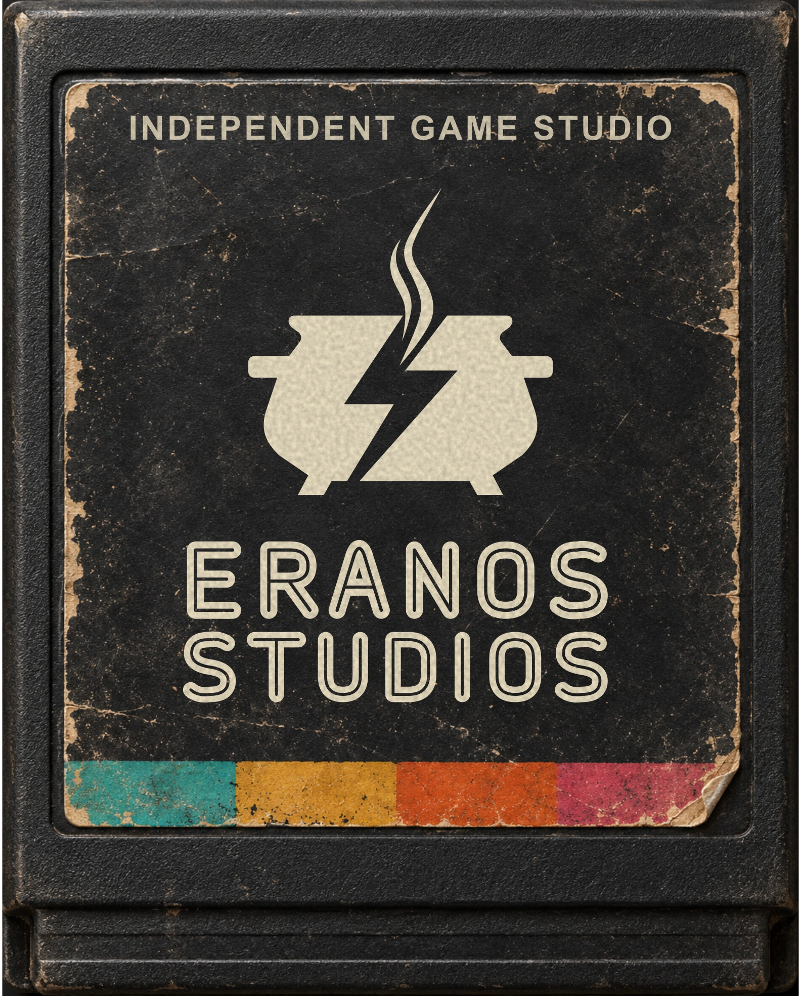
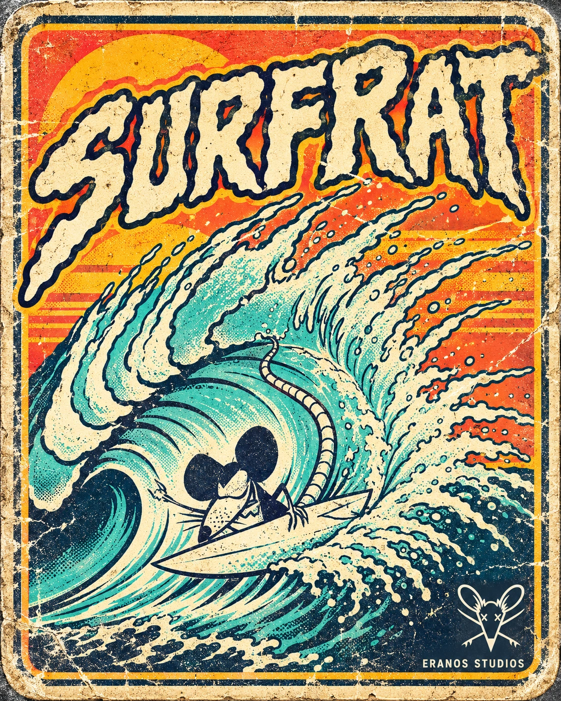
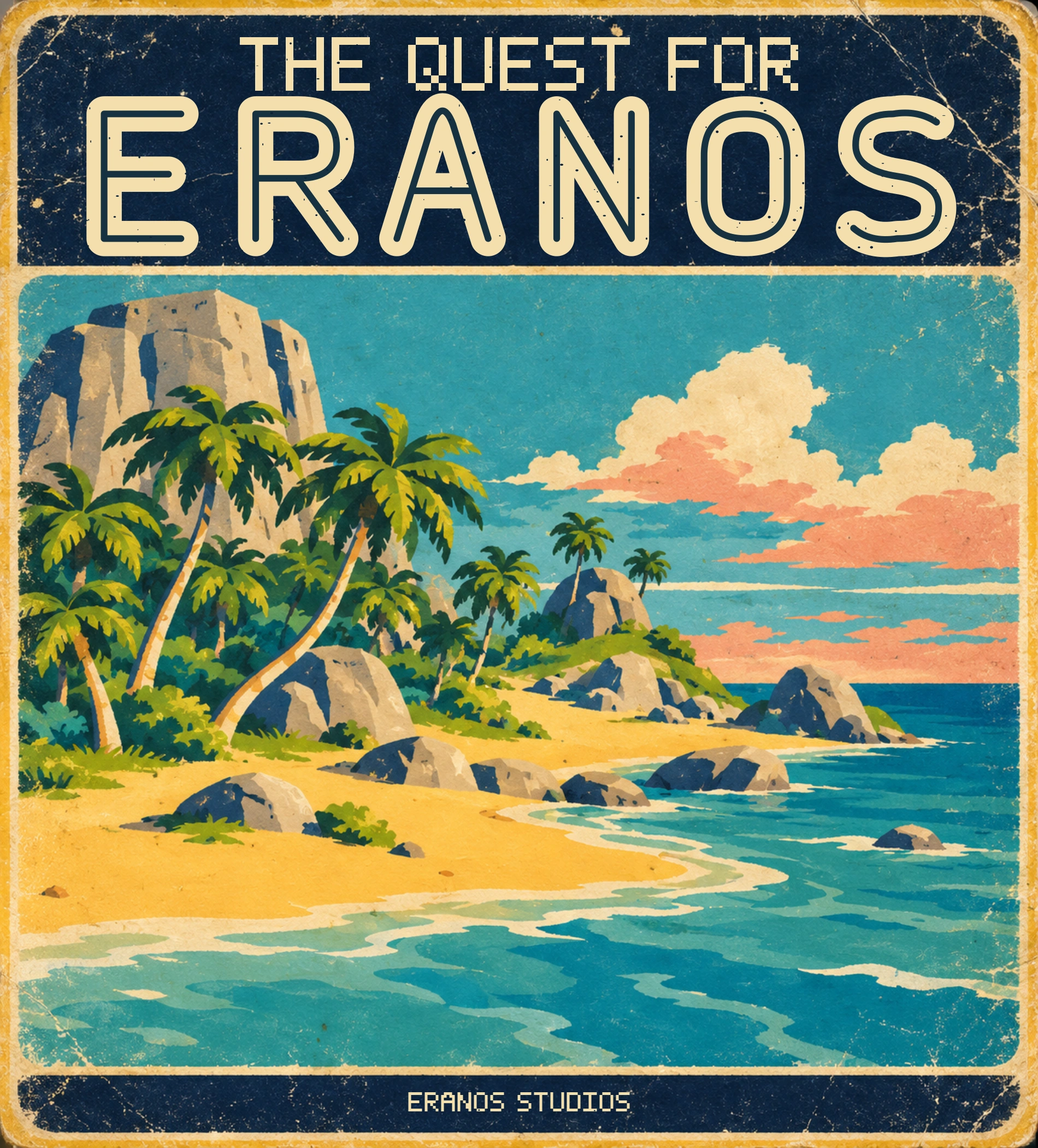
Frayed checker fabric frames the studio reel as it does on the original site. It brings the rough, graphic energy of BMX and skate culture into the page’s architecture.
Walnut fascia and dark trim recall the furniture-like hardware of early home consoles. On the site, the wood acts as a full-width physical separator between digital scenes.
INDEPENDENT SPIRIT / COLLECTIVE IMAGINATIONExpressive lettering, cutout edges, and an informal placement make the brand feel personalized. These are the original team and Level Up graphics used across the site.
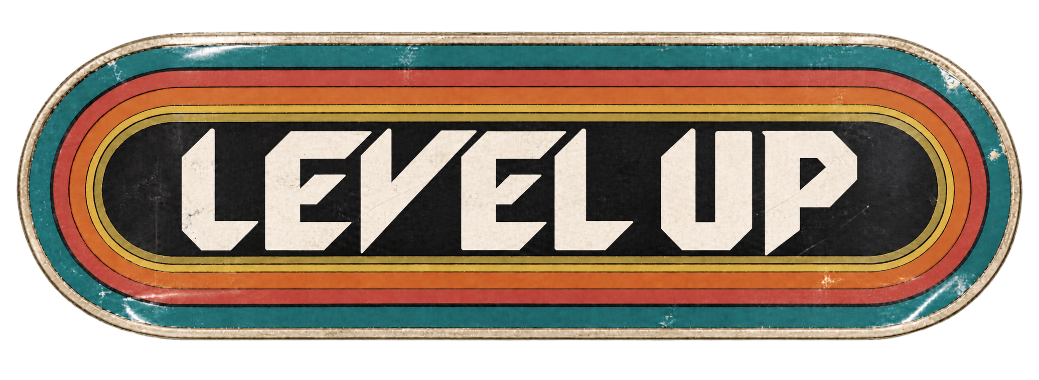
Worn print, looping geometry, and a shared spectrum of color. Each header brings a different rhythm to the same visual language. Select an artwork to explore it in full.
A worn instruction card turns a service explanation into something you might find inside a game box. The original typography, numbered steps, paper treatment, and player pairing carry the brand into practical information.
The symbol, cartridges, canvas, wood, stickers, and game card make one connected world. The result is a studio introduction that communicates through material, memory, and play.