TOOLS FOR THE
STORIES STILL
TO COME.
A creative supply house for artists and storytellers. From the first blank panel to the finished render, the identity connects practical tools with the imagination they set in motion.
Explore the live store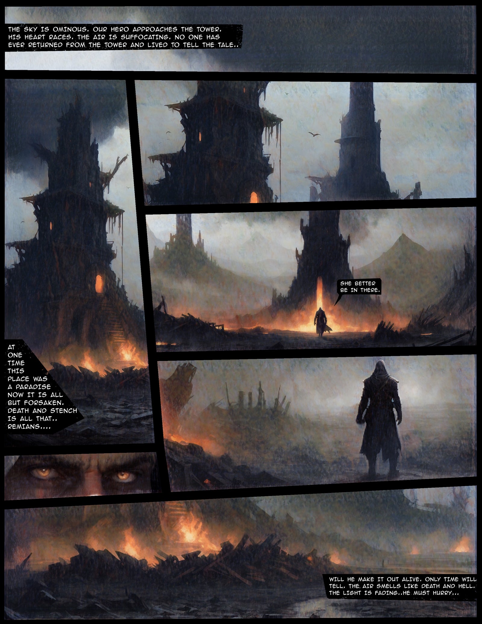 MAKE A WORLD. / TELL A STORY.
A maker’s mark.
A workshop spirit.
The compact, angular wordmark carries the weight of a workshop stamp. Horizontal rules lock the name together; the hard-edged letterforms bring a sense of craft and weight to the digital storefront.
 Primary / White on blackOne color / Black on white
A name that speaks to craft. A mark that works across the storefront, software covers, books and apparel.
Condensed energy.
Everyday clarity.
Barlow Condensed gives headlines and navigation a firm, upright voice. Inter keeps supporting text readable. The contrast lets expressive product art sit beside clear, useful information.
YOUR STORY.
A place for ideas to become panels, characters, scenes and stories.
abcdefghijklmnopqrstuvwxyz
0123456789 / & ! ?
Reading / Inter
A neutral stage.
Worlds full of color.
The storefront is built on black and white. Product covers and story artwork supply the color: warm paper, ember light, gold titles and cool atmospheric scenes. The frame stays consistent as the catalog changes.
Black and white are the interface foundation. Gray and warm gold describe recurring image tones, rather than a fixed interface palette.
Different tools.
One creative shelf.
Digital kits, Blender utilities, physical books and illustrated apparel share a home. Large product images do the explaining, while direct names and format labels help artists find the right tool.
8 selected products
Show what’s
possible.
The artwork gives the tools a destination. A graphic novel page shows pacing and composition. A character study suggests a world beyond the template. Detailed line art carries that same visual voice onto a shirt.
Inspiration first.
A clear path to making.
The store opens with a finished story image, then moves into the tools behind the work. Product pages pair a large cover with the format, description and purchase controls. Tutorials support the step from browsing to using a kit.
Lead with the outcome.
The opening comic artwork makes the store’s creative purpose visible before the catalog begins.
Make the format clear.
Product names and imagery distinguish downloadable resources, physical books and apparel.
Support the next step.
How-to content gives the kits context. Curated workstations and studio gear sit alongside the Forge’s own creative products.
THE IDEA IS YOURS.
MAKE SOMETHING
OF IT.
A store built around the act of creating. One recognizable identity brings tools, art, books and the maker’s mindset together.
Visit The Forge FX